


Spice things up with these steamy flicks.
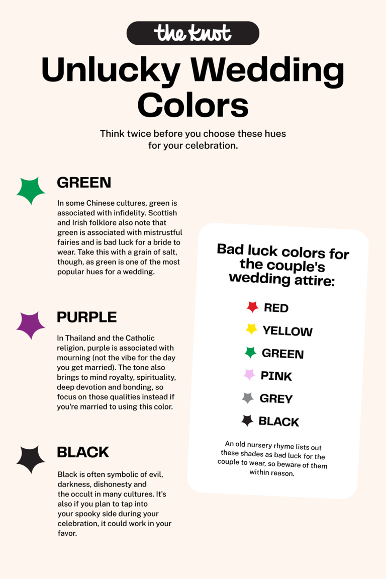
Updated Oct 14, 2024Bad Luck Wedding Colors (and Other Faux Pas) to Know as You Pick a Palette
What shades to avoid based on color theory and superstition.

Illustration by Jordan McKay for The Knot
Even if you aren't the type of person that avoids walking under ladders or gets sweaty palms around broken mirrors, you've probably spent a sleepless night or two researching wedding superstitions to ensure you're in the clear (supernaturally speaking). And if you've just begun planning, bad luck wedding colors are likely at the top of your to-Google list. Figuring out how to pick wedding colors can feel complicated enough without any wedding color superstitions thrown into the mix. But you can use these mythical associations as a way to narrow down your options and better curate the type of energy you'd like present on your wedding day. And we're listing these wedding color superstitions out below. Even if you aren't prone to the spooky and spiritual, there are some very concrete wedding color mistakes you should be aware of that go beyond just colors to avoid at a wedding.
Before you dive in, take a breath. If you're reading this, you're likely in phase one of wedding planning, which means you have some time until the day and are working to find your wedding style (The Knot Style Quiz can help you find the right look and offer color scheme ideas, btw). You have plenty of time to sort out the details, so have fun in this creative, inspirational part of your planning process. In the meantime, see what colors are bad luck for a wedding and learn some artist-backed color strategies to avoid palette panic below.
In this story: Bad Luck Wedding Colors | Wedding Color Mistakes
Bad Luck Wedding Colors
Bad luck colors for weddings change from culture to culture, so take them with a grain of salt (especially if your go-to hue is on this list). Chances are, you'll be able to find an auspicious meaning behind any shade, even if it has a blighted reputation in certain contexts. But if you're going to be mindful of bad luck wedding superstitions as you review wedding color schemes, take note of the shades below. (And after that, review some lucky and unlucky wedding dates.)
FEATURED VIDEO FROM THE KNOT
Design: Falak Khoja
Green
Photo: Stocksy
We know what you're thinking: How can one of the most popular wedding colors be bad luck? In some areas of China, green is associated with infidelity. Legend has it, if a man wears a green hat in particular, it's an indicator that his spouse has been unfaithful—not exactly the vibe you're going for on your wedding day. Beyond Chinese wedding traditions, Irish and Scottish folklore indicates the hue symbolizes the presence of mistrustful fairies, who are attracted to beautiful things and seek to steal them. (This is especially problematic if one marrier wears the color on the wedding day.) At the same time, green can indicate new beginnings, like the first sprouts of spring, so don't be too afraid of its unlucky connotations. It's still considered a current wedding color trend.
Purple
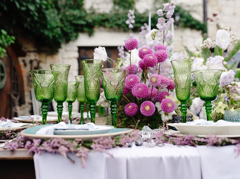
Photo: Stocksy
Purple is tied to funerals and mourning in Thailand and also in the Catholic religion. (A little morbid for a day that's all about embarking on a new chapter of life.) For example, actors in Italy supposedly don't wear purple while they perform and wedding gifts aren't typically wrapped in purple paper. However, the hue also is related to spirituality, royalty, deep devotion and the bonding of two souls, so those positive qualities might cancel out the morbidity.
Black
Photo: Stocksy
Black is both an unlucky color in traditional Indian weddings and a bad luck color at Chinese weddings, so it's safe to say you might think twice before weaving this tone into your wedding palette. The superstition about this wedding color is that it brings the energy of death, darkness and dishonesty, none of which you'd want at your nuptials. It also evokes the occult, but if you plan on summoning your spooky side at the celebration, it could be a fitting shade to embrace regardless, especially if you aren't wary of superstitions like if a Friday the 13th wedding is bad luck or not.
Yellow
Photo: Stocksy
In Spain, yellow correlates to the devil and is avoided in terms of attire on certain occasions like exams and job interviews. In Russia, yellow flowers are a sign of wanting to end a relationship, while in Iran, buttery blooms suggest hatred (harsh). And in terms of less-severe wedding color superstitions, yellow roses in particular are symbolic of friendship. On a positive note, you could view incorporating these blossoms into your wedding florals as a sign that you and your partner are friends just as much as lovers. Conversely, they could be interpreted as a hint to a lack of romantic feelings (aka: the friendzone). Yellow is also associated with knowledge and is actually considered one of the lucky wedding colors of India, as it's front and center at festivals and other joyful celebrations.
Wedding Color Mistakes
Beyond bad luck colors for weddings, there are some genuine oversights and errors you can make while selecting your "I do" hues. We tapped Lexi Hannah, an artist and live wedding painter who's captured over 100 celebrations, to provide some intel on what colors don't go together and more mishaps to avoid as you pick a wedding palette. Arguably, one of the biggest wedding mistakes you can make is choosing wedding colors that don't truly feel like you.
1. Using Too Many Colors
We love a wedding that's full of eye-catching colors and details, but the honest truth is that there is such a thing as too much. Your wedding color palette doesn't need to be boring by any means, but it should be curated and pared down to avoid visual overload. "Limiting the number of colors helps maintain cohesion and prevents the design from becoming visually overwhelming," says Hannah.
Wedding Editor's Tips: How many wedding colors should you have? With a few exceptions (see our next fix), a palette of two to five colors strikes the ideal balance. "This would typically include: One or two main colors serving as the foundation of the palette, accent color(s) to add depth and interest and a neutral to ground the palette and provide balance," says Hannah. Using the same colors throughout your wedding decor will help create a cohesive flow, so every detail looks like it belongs. Narrowing your palette down to a few colors will also keep elements like your centerpieces from looking messy. You can play around with lighter and darker versions of the same color too—this will add depth without looking chaotic.
2. Limiting Yourself to Only Two Distinct Colors
We're so over the strict two-color "rule." Many gorgeous weddings incorporate a whole slew of hues that effortlessly work together. A two-tone wedding color palette might leave you feeling boxed in in regards to your choices for decor, flowers and even attire, which is something you generally want to avoid.
Wedding Editor's Tips: Use accent colors to your advantage when you're building out the color scheme. You can offset one or two focal colors with a handful of neutrals, like cream, black, brown or gray. Another way to avoid the two-tone look is to use multiple shades of the same color for a tonal effect. One example: Try a summery color palette inspired by the many shades of hydrangeas, including dark and light blues, with pops of white and green.
3. Ignoring Undertones
In order for colors to work together, their undertones and temperature should be simpatico. "Colors possess warm or cool undertones that significantly influence their interaction with other colors," says Hannah. "For instance, a dusty blue with warm undertones will pair differently with blush tones compared to a cool-toned blue."
Wedding Editor's Tips: Not all of your wedding colors have to match undertones. But if you're trying to marry, for example, opposite colors like blue and orange without the pair appearing too punchy and over the top, you should select shades of those colors with correlating undertones (a warm, spicy orange with a warm blue that has brownish undertones).
4. Choosing Trendy Colors Just to Be Trendy
It's easy to get excited about what you see at other weddings, but just because you love an idea on paper, doesn't mean it's the right choice for your wedding. Your color palette should be one that genuinely resonates with you, since you'll be looking at photos and videos of the day for decades to come—long after the trends have gone.
Wedding Editor's Tips: Trending wedding colors can be a great starting point for your inspiration, but if you're not personally a fan of something, don't force it. Instead, think about the colors and patterns you surround yourself with daily. Ask yourself: What colors make you happy? What color is your favorite vase or sweater? The simplest objects, like a scarf or even a pillow, inspired some of the prettiest weddings we've seen. After you've finished defining the kind of wedding you want, you can revisit any trends that caught your eye to decide if something actually works for you.
5. Not Choosing Colors That Balance One Another
One of the biggest wedding color mistakes is forgetting to add some "breathing room" into your color palette. You don't want to overwhelm the eyes by using multiple dominant colors without incorporating some secondary colors to tone them down.
"A successful color palette achieves a harmonious balance between cohesion and dynamism," says Hannah. "This palette balances light, dark and midtones. Incorporating a range of shades prevents the palette from appearing flat and adds visual interest…Approach your wedding palette as an artist approaches a canvas, striving for balance and focal points."
Wedding Editor's Tips: A good rule of thumb is for every statement color, add a neutral tone or softer accent color to complement the first one. So for example, if bright fuchsia is one of your dominant wedding colors, you can pair it with a pale blush or mauve tone to take the edge off. Or if you have two dominant colors, like orange and red, you can balance the palette with neutrals, like ivory and metallic gold. You want your colors to be complementary to your decor, but not distracting. Using secondary colors to create balance and contrast will let your main colors shine instead of clash.
6. Choosing Colors That Compete for Attention
"Colors tend to clash when they compete for attention rather than complementing each other," says Hannah. "Some ways this discord can arise is from mismatched undertones (combining colors with differing undertones, such as a warm pink with a cool red, can result in a jarring effect), lack of contrast (utilizing colors that are too similar in tone without sufficient contrast, which can cause elements to blend together and diminish visual interest) and imbalanced proportions (featuring multiple bold colors without grounding neutrals can create a chaotic and overwhelming aesthetic)."
FOR YOU
Wedding Editor's Tip: Prioritize complementary contrast and analogous pairings to evoke harmony in your color scheme. Complementary colors are opposite to each other on the color wheel, like purple and yellow, and blue and orange. Analogous colors are neighboring, like a blush pink and soft peach. You can also play with value contrast by combining deep and rich shades with pale tones to bring depth, dimension and harmony.
7. Choosing Colors Associated With Something Else
What comes to mind when you think of red, white and blue—or red and green? Certain color combos come with obvious connotations, which you might not want for your wedding day. Unless you're having a holiday-themed wedding or intentionally want your color palette to evoke a certain well-known energy, do a double take before your final decision.
Wedding Editor's Tips: To switch up a predictable palette, the trick is to change at least one of the colors to downplay the resemblance. In December, you might use emerald green and blush instead of red if you're worried about your wedding looking too Christmassy. You can add another color to downplay the obvious combo, too. Red, white and blue—plus bright yellow—feels like a retro-inspired palette for an outdoor summer wedding instead of a Fourth of July cookout.
8. Not Accounting for Lighting Levels
Just as the paint on your walls might appear a different shade from the morning to the evening, your wedding colors will look different depending on the lighting levels. "Lighting conditions can alter the perception of colors," says Hannah. "A deep forest green might exude elegance under candlelight but could appear heavy in a bright, outdoor summer setting."
Wedding Editor's Tips: If you're stuck on a few shades, find objects in your home in the colors you're considering and test the palette out in some of the different types of light you might have at your wedding (as best you can). Try seeing how they look illuminated by candlelight, daylight and ambient light. And don't forget to think about colored light if uplighting is your thing.
9. Not Incorporating Textural Details
Don't underestimate the power of using unexpected textures and materials to build out your color palette. When you're choosing wedding decor, look for items that not only match your color scheme, but also add interesting texture and dimension to the overall wedding aesthetic. Need some examples? Think about the warm peachy-orange color of terracotta pots (they make great centerpiece vessels for a rustic wedding) or the iridescent, silvery tones of satin tablecloths for a formal setting. "The interplay of different textures and materials can influence how colors are perceived, contributing to the overall aesthetic," says Hannah.
Wedding Editor's Tips: Once you know the general direction of your wedding colors, think about how you can bring them to life by layering textures, patterns and prints. Make an impact with printed tablecloths or napkins that incorporate one of your key wedding colors. Or create visual balance throughout the room by adding repeating elements (like matching wooden chairs) to ground the space. Texture especially comes into play when you want to pair items together that are similar in color. You'd be amazed what texture can add to a simple color scheme—turn a monochromatic white palette into a modern masterpiece by layering white tablecloths with limewashed stone vases and white flowers. Even though all of the items are similar in color, the combination of multiple textures creates visual interest.
10. Ignoring Your Venue Colors
It helps to have a color scheme in mind as you're touring potential wedding venues, but try to stay open minded. Details like wall coverings, artwork and carpeting could potentially clash with your chosen wedding colors, so it's up to you to decide what's more important—the venue or the color palette.
Wedding Editor's Tips: The other way to approach this is to keep your color options open until you find a venue you love. In a country club with navy and maroon carpets, a color scheme of lime green and hot pink will clash, and there's really no way around it. (Try to pull it off anyway and you'll end up spending twice what you normally would in decor to cover it up.) That's not to say you have to choose a venue where your colors perfectly match the floors, but you should factor in the venue's existing decor for the most seamless look.
11. Neglecting Your Stationery and Paper Elements
Your wedding stationery sets the stage for the whole event, so use it to introduce your wedding colors from the start. The colors can also subtly convey the theme and formality of the wedding. Black and white invites with calligraphed envelopes indicate a black-tie event, while bright watercolors are more in line with a beach wedding. Luckily, The Knot Invitations has a wide selection of invitation suite designs (all of which come in a multitude of colors) to coordinate or delightfully contrast with your wedding palette.
Wedding Editor's Tips: Coordinating the invitations with your wedding palette can be as easy as choosing a colored font, ribbon or monogram, or as elaborate as colorful paper embossed with your wedding details. Most importantly: Don't sacrifice readability for style. The typeface should contrast with the paper so that it's easy to read. Also, you can match your The Knot stationery to your The Knot wedding website, no matter the details you choose.
12. Trying to Perfectly Match the Flower Arrangements
Don't be upset if the colors that don't match your flowers are the ones you're most drawn to. Put your trust in your wedding florist to pick complementary flowers that make sense for your style and budget, even if they're not an identical color match.
Wedding Editor's Tips: Remember when we talked about incorporating different tones and shades of the same color? Flowers are a great way to do this naturally. There are very few flowers that will perfectly mimic your wedding colors, especially if blue is one of them (only a handful of flowers are naturally blue). Keep an open mind about using flowers that capture variations of your wedding colors to achieve a more dimensional color palette.
13. Relying on Attire to Convey the Color Scheme
Your wedding attire and accessories can tap into your wedding colors, but they shouldn't be the driving force. Focus first on choosing a look that you really love, then you can think about how to weave your colors into the ensemble (if at all).
Wedding Editor's Tips: Colors like olive green and pale yellow might look amazing for tablescape details, but they aren't always wearable. When you're choosing bridesmaid dresses, groomsmen suits or other wedding attire, we recommend looking for pieces that are flattering for a range of skin tones and body types to help everyone feel their best, which is the most important thing. If you really want to incorporate your wedding colors, do it subtly through jewelry, socks, ties or flowers (bouquets and corsages).
14. Choosing Colors That Don't Fit the Vibe
The vibe of your nuptials can guide what colors to embrace and what colors to avoid at a wedding. Cheerful coral might be your favorite color, but it's not the best pick for a glitzy New Year's Eve wedding. Likewise, shimmering metallic silver might not set the right tone for a cottagecore wedding in the countryside.
Wedding Editor's Tips: If you're set on a color, but you're unsure if it will p[air well with the wedding vibe you're trying to create, think about what you can do with your accent hues. Pairing coral with dark navy blue or black makes it seem more formal, while pastel accent colors would take it in a whimsical direction. Your color scheme will ultimately set the mood for your wedding, so decide how you want the event to feel before making any final decisions about colors and decor.
15. Limiting Yourself to Seasonal Color Rules
Some colors are closely associated with specific seasons: pastels for spring, orange and yellow for fall, red for winter—you get the point. Choosing a seasonal color palette has its benefits, but you should feel empowered to branch out and get creative.
Wedding Editor's Tips: Your color palette doesn't need to be blatantly inspired by your wedding season, but you can tailor it a little bit through accent colors, flowers and decor. Pastels in winter? Switch them up by using a gray-based mauve instead of a rosy blush pink, or a dusty sage instead of mint green. Pairing your color palette with seasonal flowers and seasonally inspired decor elements will bring everything together without seeming overly themed.
16. Not Giving Visual Examples to Your Wedding Pros
"Light blue" might mean something totally different to you than it does to your wedding planner or florist, so it's best to over communicate when you're sharing your wedding vision with your team of pros.
Wedding Editor's Tips: Avoid this wedding color mistake by sharing plenty of visual examples of what you want. The goal isn't for your wedding vendors to copy those ideas exactly, but rather to understand the mood, color palette and level of formality. Interactive color wheels and color palettes from weddings you like are good places to start. Create an inspiration board with paint chips or fabric swatches, or share inspirational photos for the tables, flower arrangements, attire and decor. Another tip: Look at Pantone color guides and take note of the names and color codes of hues you like. Graphic designers and stationery pros often use Pantone colors as their source of truth, and some cake bakers use Pantone numbers as a reference when decorating with colored frosting.
17. Choosing Wedding Colors You Don't Love
"While guidelines exist to assist in creating a harmonious design, it's essential to prioritize what resonates with you personally," says Hannah. "The most memorable and impactful color palettes are those that authentically reflect your unique style and vision."
Wedding Editor's Tips: Notice the hues that appear in your wardrobe and around your home to determine what colors you love to see on the day to day. Don't worry if they don't feel like traditional wedding colors. You shouldn't focus on trying to make your wedding feel like a wedding, just think about making it a celebration of you and your partner, just as you are.
Additional reporting by Samantha Iacia.


